Solved is a cleantech advisory service and collaboration platform. Solved brings together the leading experts and new ways of working in order to cocreate appealing solutions.
The goal in this project was to create an innovative platform that helps stimulate the exchange of ideas between cleantech experts and guides discussions to solve environmental challenges.
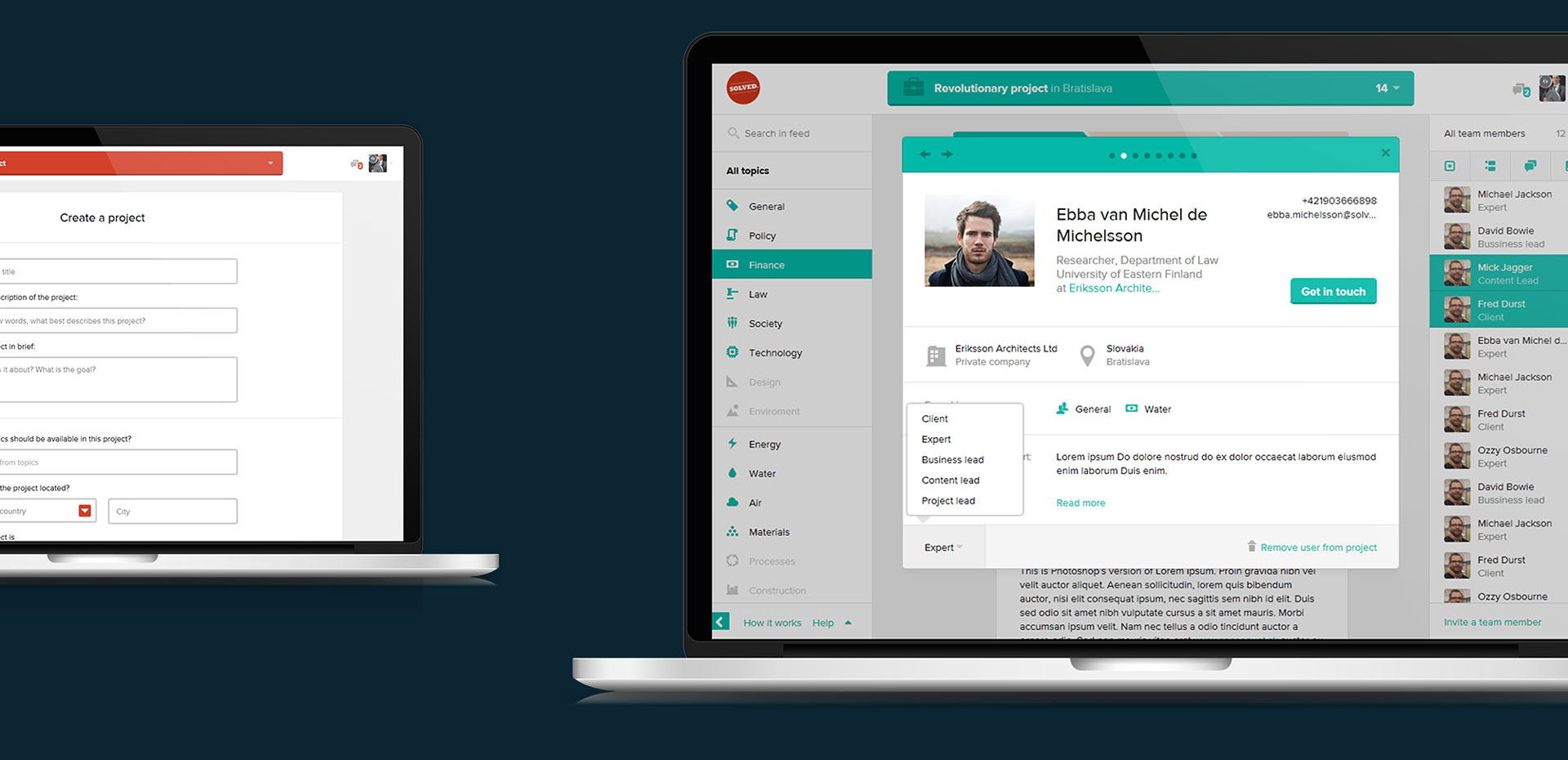
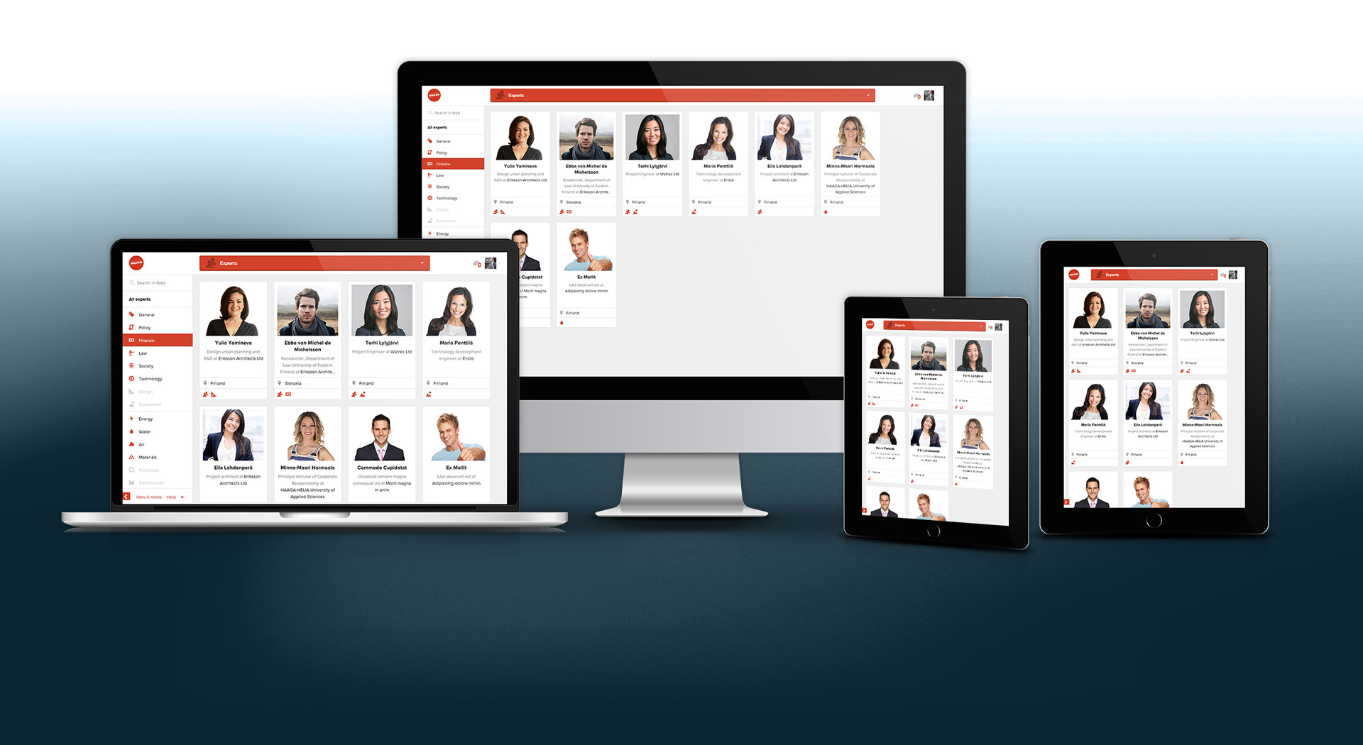
In the first phase of design we assumed the layout would work only for usual notebook screen sizes. But then we realised that if we would hide sidebars it could easily fit down to 640 px screen size and that would work for most of the tablet devices.
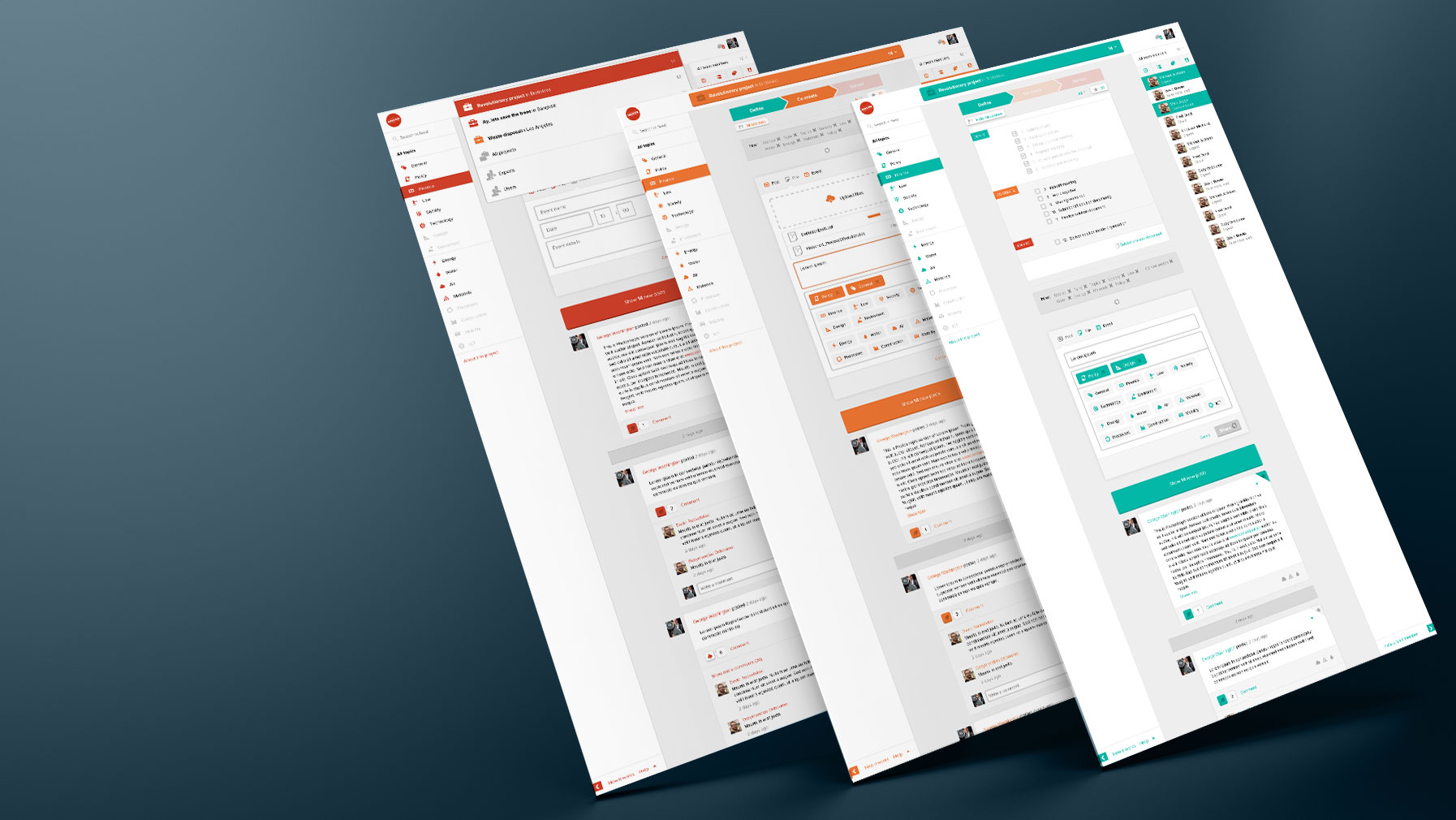
One of the challenges was to create three color themes for each stage of the project, which would affect the design of the whole UI. Meanwhile the default theme for the rest of the UI was actually one of the stage themes. There were several possible solutions and we chose to use one main class on the root element to rule all child elements.
Behind the scenes
SCSS Mixin to simplify theme creating
To simplify theme creating, I have written a SCSS mixin and then called it with the arguments I needed to apply colors.
Thanks to SCSS preprocessor I was able to simplify my work with mixins and extends. I created a mixin that would parse one argument as CSS property and the second argument as type of color ( $color == 'hover' ). Then I used placeholder selectors, which I later extended in the code.
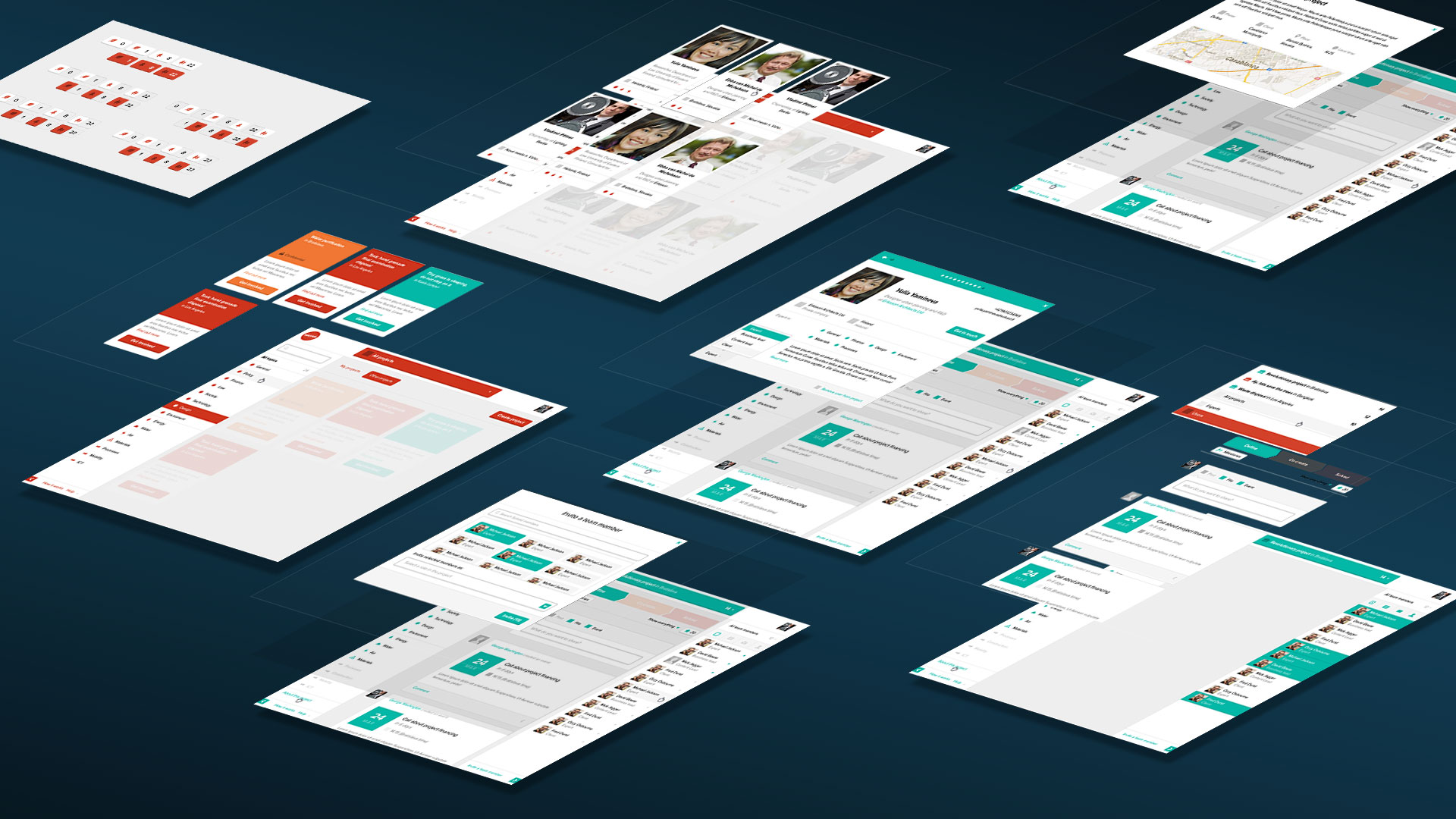
When designing large web apps, you will usually end up with lots of UI components as buttons, form elements, icons, modal windows, list items etc. To keep your design consistent and modular, it is important to create UI Kit, to always keep track of components. From the developer perspective it is essential to split CSS files (SCSS) into modules and groups of components to keep code readable and easy to understand.
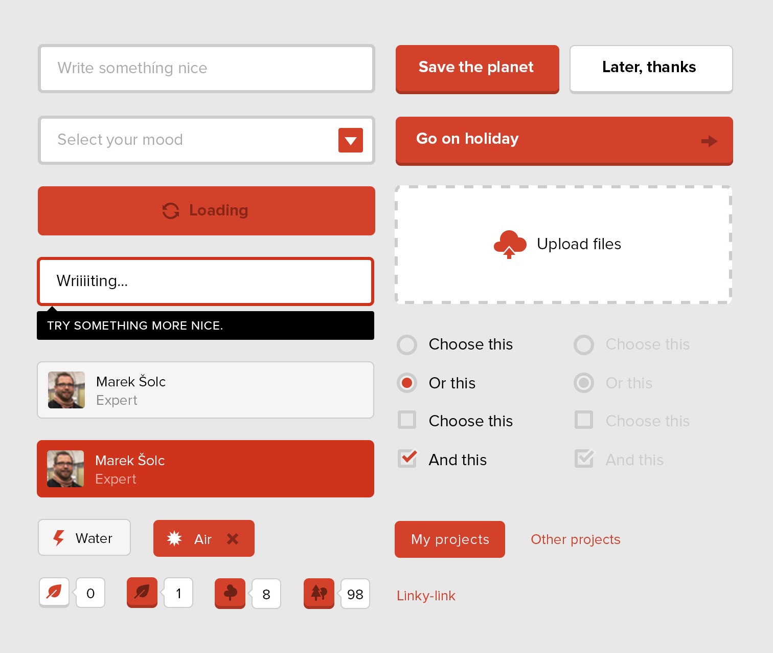
UI Kit
Important part of good web app is well designed and modular components
Fluid layouts
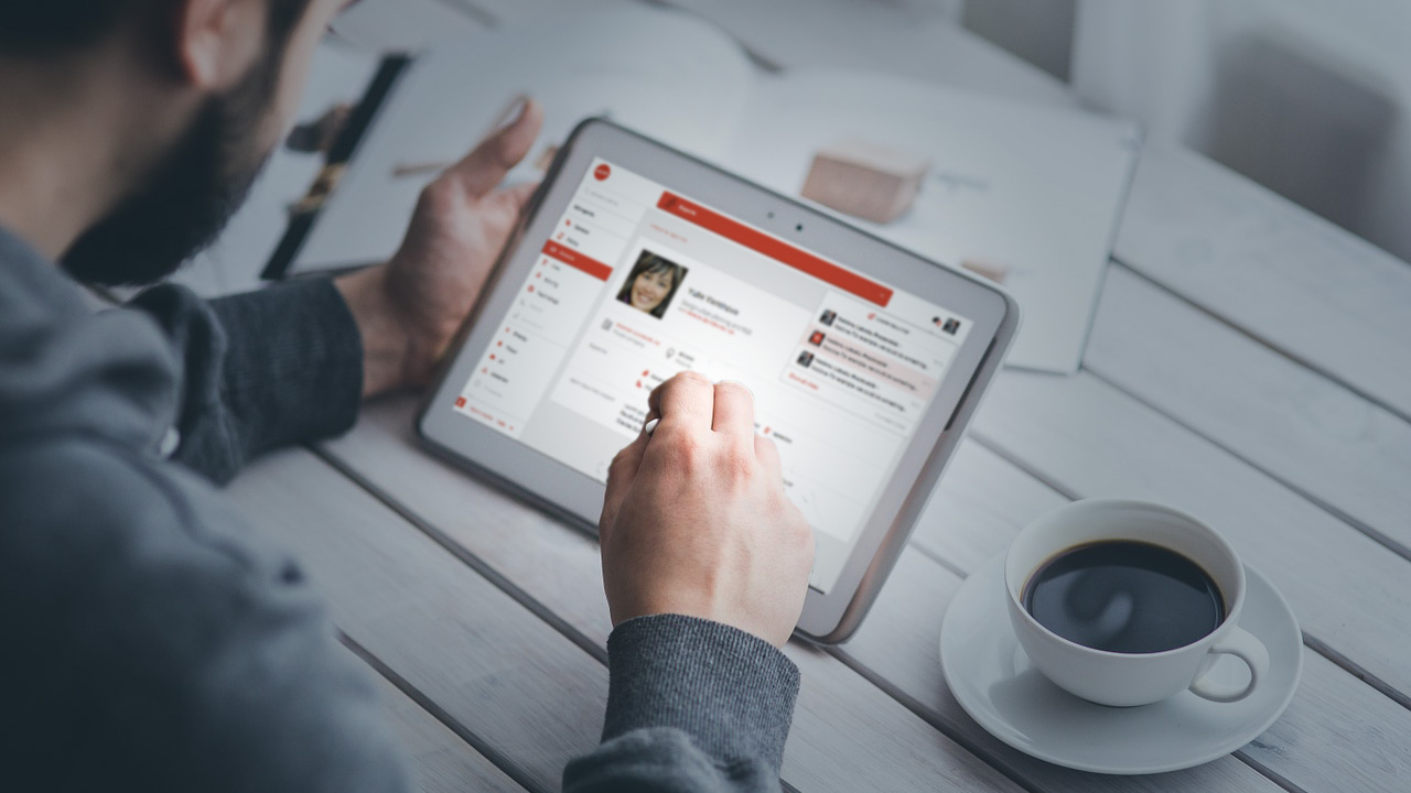
Works perfectly on your tablet, big screen or nootebook
Functional design
Clean and minimalistic
To keep the design easy to understand, you want to keep it as simple as possible. We were able to achieve it thanks to modern, minimalistic and flat design.